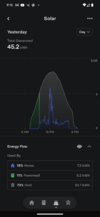
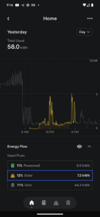
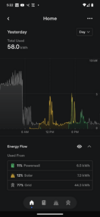
This is an artifact of how it is trying to present info and arguably a bug. In your second screenshot, you can see that before 9 a.m. where there is just a little solar, it is showing the solar on the bottom, and the grid above it, and it looks normal.
For some reason after 5 p.m. when there is little solar, it is showing solar on top, with the grid below it. So the solar is just the width of the solid yellow line during that time period, with the grey below it the grid. You can see the difference starting at about 4:30 p.m.; before then the solid yellow line is shaded yellow beneath it; after 4:30 p.m., it is shaded grey beneath it.
Cheers, Wayne