aesculus
Still Trying to Figure This All Out
@wwhitney and @getakey are on two different themes: @getakey doesn't want to track his energy sources, he is merely pointing out that whatever solar energy he produces should be going to the grid for full credit. In fact he is ONLY credited for solar exports when they are produced and is not supposed to exporting energy he acquired from some other source. So in the simple peak example all the house load would be satisfied by PW discharge and all solar energy produced would be going to the grid for credit.
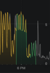
The Tesla algorithms (have been?) doing a good job of this. But in the latest release it appears that either the powerwalls are not covering the house load as they are supposed to, or Tesla's graphing engine is not showing the correct discharge for the devices.
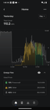
@getakey do you have the ability to host Powerwall-Dashboard ? If so it may be able to show you what is happening locally. It takes data directly from the GW vs taking it from the Tesla servers. It is showing what the CTs are reading.
The Tesla algorithms (have been?) doing a good job of this. But in the latest release it appears that either the powerwalls are not covering the house load as they are supposed to, or Tesla's graphing engine is not showing the correct discharge for the devices.
@getakey do you have the ability to host Powerwall-Dashboard ? If so it may be able to show you what is happening locally. It takes data directly from the GW vs taking it from the Tesla servers. It is showing what the CTs are reading.