Welcome to Tesla Motors Club
Discuss Tesla's Model S, Model 3, Model X, Model Y, Cybertruck, Roadster and More.
Register

Phony Solar Demo in App

This site may earn commission on affiliate links.
I have a Model Y, as well as solar panels and Powerwalls installed by Tesla. I am quite happy with both. Of course I run the Tesla app on my iPhone. Overall I am more impressed with the way the app supports the home (solar/Powerwall) than the car.

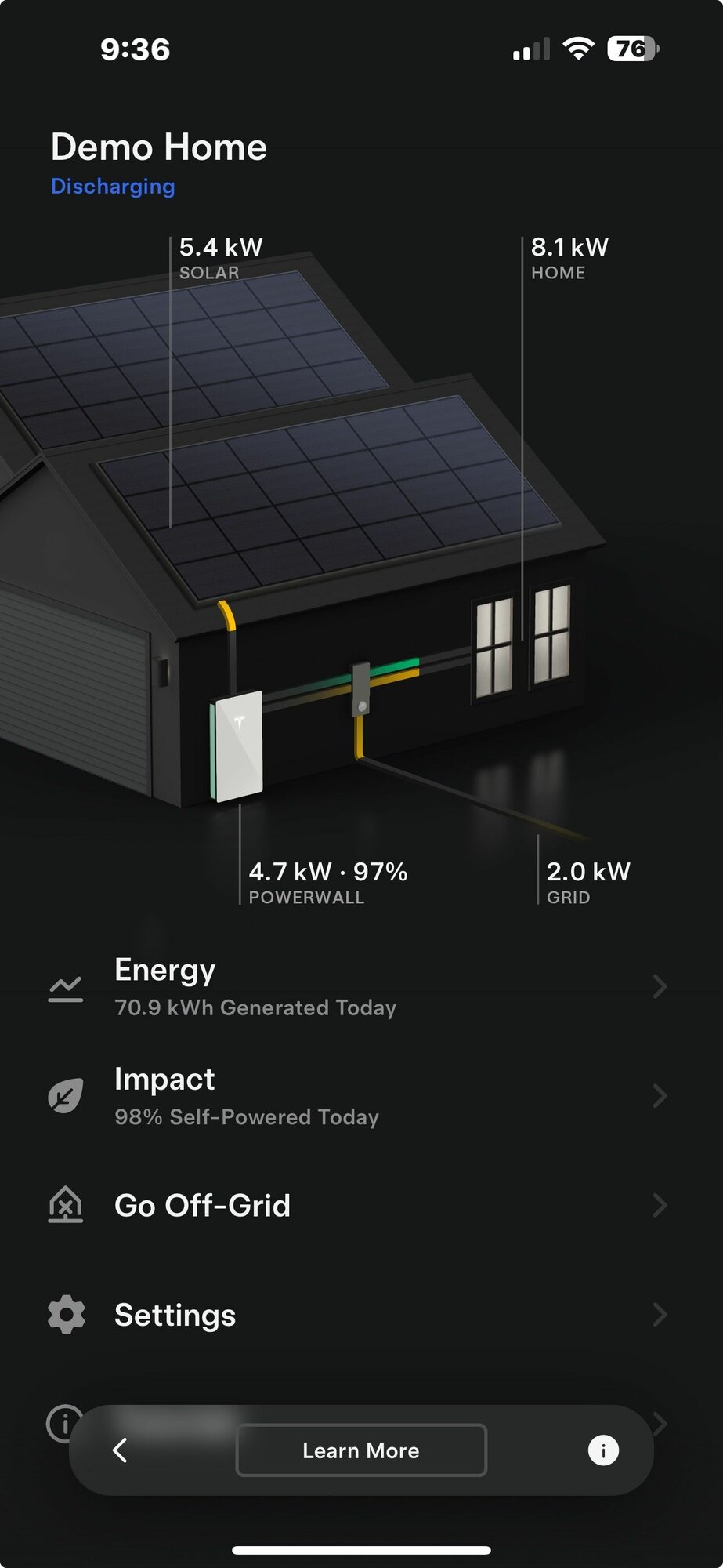
Despite having Tesla solar and Powerwalls, Tesla occasionally sends me email trying to sell me one or both. The one that came today emphasized the Poweralls. It instructed me how to navigate within the app on my phone to a screen that resembles the one I already use for solar/Powerwalls, but it is a Demo. It looks like this.
Screenshot 2024-05-06 at 9.36.14 PM.jpg

It doesn't entirely make sense.

Total energy generated for the day is 70.9 kWh. A graph of that shows a hill with no flat at the top, and is down at zero at the right end. Mine has been in operation for over a year and has NEVER had a graph of that shape. The high point I get on that graph is about 7.7 kW, the maximum capacity of the inverter. Any day I have come close to 70.9 kWh the graph has been flat across the top for most of the day.

But the screen shot above shows that that panels are still putting out 5.4 kW despite the graph showing the solar input is over for the day. So is it zero now (graph) or 5.4 (front screen)? Further, I do not believe the area under the curve is close to the 70.9 kWh total shown.

It gets worse. Suffice it to say, the flows don't make sense. The panels putting out 5.4 kW, the house consuming 8.1 kW, 2.0 kW being sent to the grid, and 4.7 kW coming from the Powerwall seems to add up, but why on earth is the Powerwall being drained to send a trivial amount to the grid?

I would say the "Demo" comes close to false advertising, but I don't know if it is the result of malice or stupidity.
 
No, nothing specific to my home, and that doesn't matter. The contradictions are within the data shown.
Quite possible with this just being a demo that different screens aren't necessarily meant to be fully connected and/or represent the same point in time as much as they are meant to show off the majority that could be shown off on each particular screen just to give someone a better idea of what different screens would or could show.
 
No, nothing specific to my home, and that doesn't matter. The contradictions are within the data shown.
The contradictions in the data dont really matter in demo, which is just ment to be visible representation of stuff. Thats why I asked, and thats why it does matter. If it was supposed to be a demo of your home, its perfectly valid to be upset with the data. if its a generic demo, it really isnt.
 
Latest justifications for Solar seems to be to calculate time of use benefit of having a storage battery + Solar. You no longer get much $ selling your excess production back to the Utility.
You will generally use less energy than the panels generate, during the peak productive Solar production hours. All that excess will be pumped into your storage battery (till full). Later, when prices are at the peak, you can use that stored electricity to run your home, essentially for free.
This time of use optimizing strategy can pay off your Solar system (eventually)
Edison, in SoCal, will also give you a discounted rate for your electricity purchases if you own an EV.
 
The Demo is intended to help sell the product, or such is my interpretation of the promotional email urging me to try the demo and buy the product. As such it seems to me that while it is certainly imaginary it should not be misleading.
 
The Demo is intended to help sell the product, or such is my interpretation of the promotional email urging me to try the demo and buy the product. As such it seems to me that while it is certainly imaginary it should not be misleading.
I don’t see it as misleading. Odd perhaps, yes.
The numbers add up. The only scenario I can think of is if the PW is set up to import at low cost periods and export at times where the user gets paid a higher rate.

All in all, really seems to be making a mountain out of an anthill.
 
  • Like
Reactions: jhn_
I don’t see it as misleading either. As others said the screens are independent representations of what the data will look like.
It was a choice to keep them separate and show a fulls days production on the graph and on the home graphic show more middle of the day production. That choice might not be the most clear on first glance, but I think it makes sense once you accept they are not supposed to be the same point in time since the same point in time would not be the most explanatory of the systems capabilities.
The system is definitely working in some sort of cost savings mode, with the home graphic. That is normal graphics for that mode.
And your personal flat-topped solar generation is because you have clipping. Your solar panels can generate more than your inverter can handle. Everyone’s system is different and there are plenty of people with clipping like yourself, and just as many like myself and the demo graph whose system has more inverter capacity than solar capacity and we have nice parabolic curves in our solar generation graphs.
 
  • Like
Reactions: Zythryn
I agree that they should have made a set of consistent graphs that made sense. Why would you be sending 2 kW to the grid when your solar is less than your energy requirements, thus depleting your battery unnecessarily? Presumably that would only happen when the sell price was high enough you could recharge later when the buy price was lower than the current sell price. The settings show the buy and sell price being the same at each time of use point - don't they always discount the buy price? You can change the settings, but they don't stick, so they don't actually give you a feel for how the system would react in different situations.

Calling it a demo is a bit of a stretch.
Something like that would seem to be more along lines of a simulation. A demo is usually more of an overview of a product showing examples of different features, which can be limited as well, mainly to demonstrate them to give a sense of the product.