Definitely need the chrome delete on the windows for that look.I'd probably go white on white, but I haven't seen that combo. I love the white interior on the S/X, but I've only seen it on other colors.
EDIT: Here they are in white with black rims, and I love it!


Welcome to Tesla Motors Club
Discuss Tesla's Model S, Model 3, Model X, Model Y, Cybertruck, Roadster and More.
Register
Install the app
How to install the app on iOS
You can install our site as a web app on your iOS device by utilizing the Add to Home Screen feature in Safari. Please see this thread for more details on this.
Note: This feature may not be available in some browsers.
-
Want to remove ads? Register an account and login to see fewer ads, and become a Supporting Member to remove almost all ads.
You are using an out of date browser. It may not display this or other websites correctly.
You should upgrade or use an alternative browser.
You should upgrade or use an alternative browser.
- Status
- Not open for further replies.
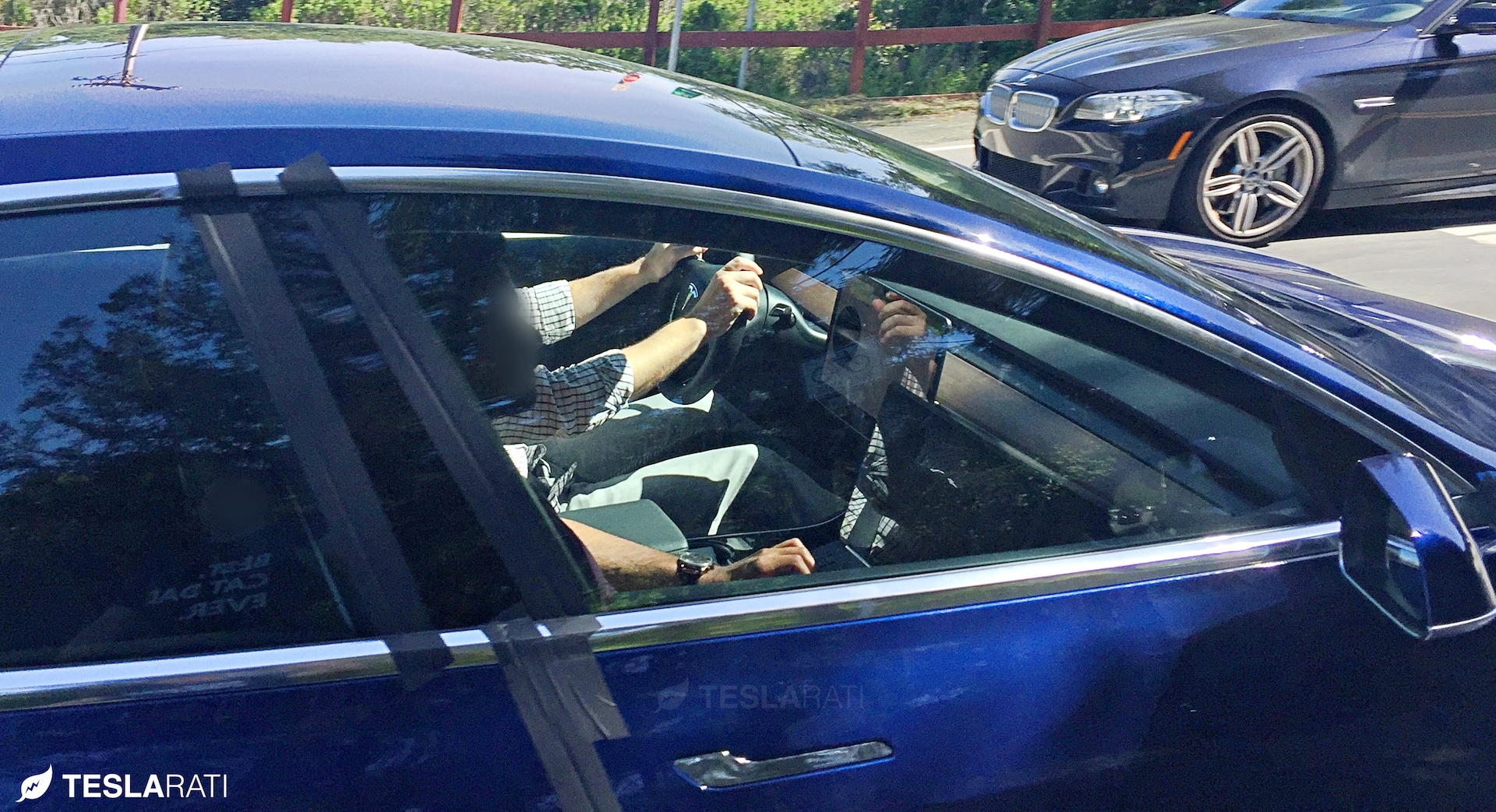
Also, why did they tape everything?
My guess is that the door and hood seals are not installed yet, and they are trying to reduce the wind noise.
Does anybody know what size wheels are on the Prius? Trying to decide if the 3 wheels here are 17" or 18". They look kind of small on the 3, but way bigger than the Prius wheels
That Prius has 15s (that Prius also looks lowered
") )
)Does anybody know what size wheels are on the Prius? Trying to decide if the 3 wheels here are 17" or 18". They look kind of small on the 3, but way bigger than the Prius wheels
I just replaced my wife's Prius tires, and the rim is 15"
Even if it turns out they didn't hit a home run with the organization of the screen elements the UI can and will be improved over time. That is the beauty of over the air updates.
First impressions matter (especially for car reviews).
OTA updates: well, double-edged sword as Tesla is both 1) not so quick at iterating and 2) two steps forward, one step back is common in all software OTAs and the same with Tesla. Have you recently seen the Model S UI subforum?
Model S: User Interface
I'd much rather see a finished UI that gets improved versus something not-quite-done rushed out in the next two months, and weeks/months between feature updates. And, let's be real: they've had, at minimum, over 18 months to design a very well-functioning UI. It should be pretty darn great out of the gate: it's really your only way to interact with the car.
How do we clean the back side of that screen?
And what is the purpose of the section of vent behind the screen?
I just can't see ANY reason why the screen has to be floating? As if Tesla got everything else 100% right and the screen attachment 100% wrong. Unless someone can tell me one reason for having a floating screen vs properly integrating to dash at the same position.
As someone replied already, but to reiterate:
Either you make a big hump in the dash to 'hold' the screen or you raise the entire height of the dash. The latter doesn't fit the "lots of visibility" as seemingly nothing else needs to be as high as the screen (so lots of wasted dash space on the left & right).
For the former idea, the big hump, I think it would look less clean and minimalistic, which is (if you've never read a 2012 Model S review) Tesla's vibe.
For cleaning: I mean, how do you clean the inside of your windshield? Just run a piece of cloth over it.
T34ME
Active Member
I had exactly the same reaction! It adds interest to a rather plain and ordinary rear fascia. No te preocupado, this type of rear diffuser will be available in aftermarket products. The aftermarket is going to be YUGE with 400,000+ TM3's.I also love the Model 3 diffuser illusion
T34ME
Active Member
Does anybody know what size wheels are on the Prius? Trying to decide if the 3 wheels here are 17" or 18". They look kind of small on the 3, but way bigger than the Prius wheels
I have a 2012 Prius and the stock rims are 15". 17" rims were available as an option on some models. On the Prius Wagon, 17" are standard. The Prius in the picture is a 2010 - 2011 model.
BTW, Prius guys have done a lot of experimenting with energy efficient tires. The winner (for the Prius) is the Michelin Energy Saver A/S. I replaced my OEM tires with the Michelins 6 months ago and they are super quiet and added about 5% to efficiency.
Last edited:
gregincal
Active Member
How do we clean the back side of that screen?
And what is the purpose of the section of vent behind the screen?
I just can't see ANY reason why the screen has to be floating? As if Tesla got everything else 100% right and the screen attachment 100% wrong. Unless someone can tell me one reason for having a floating screen vs properly integrating to dash at the same position.
Because it sticks way above the dash. Look at this picture and tell me how to build it in without either having a huge hump on the dash or having the screen way lower:
Does anybody know what size wheels are on the Prius? Trying to decide if the 3 wheels here are 17" or 18". They look kind of small on the 3, but way bigger than the Prius wheels
The wheels do look small.. but I think it looks that way due to the large wheel gap.. if the wheel gap was tightened up.. it wouldnt look so small (I also took the liberty of giving the stock wheels some more offset to fill the fender
)I have a 2012 Prius and the stock rims are 16".
Better check again. You have 15s on your PiP
stopcrazypp
Well-Known Member
It seems pretty obvious to me. The screen needs to be that height so that the speedometer is at the right height. So the only way to integrate the screen would be to design a plastic surround with a hump. I'm not convinced this would look better. The other way would be to raise the dash height drastically, but that affects the other elements of the design (reduces the visibility out the window and would affect Tesla's new AC system design).How do we clean the back side of that screen?
And what is the purpose of the section of vent behind the screen?
I just can't see ANY reason why the screen has to be floating? As if Tesla got everything else 100% right and the screen attachment 100% wrong. Unless someone can tell me one reason for having a floating screen vs properly integrating to dash at the same position.
T34ME
Active Member
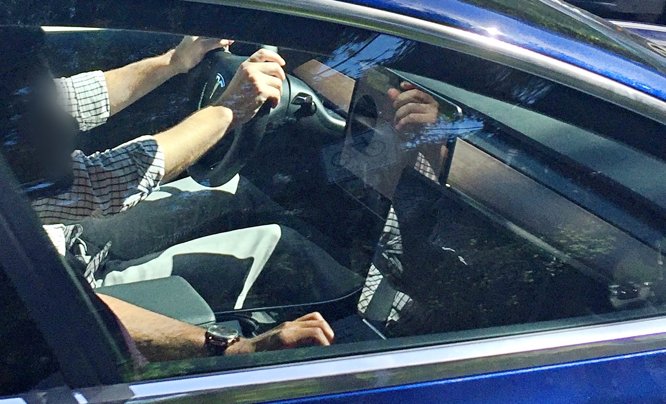
I fear there is going to be a glare/reflection problem with that center screen - you can see the drivers shirt reflected in the screen. But no worries, aftermarket or Tesla will come up with a hood surround and/or anti-glare overlay.
Last edited:
T34ME
Active Member
Sir, you are correct.Better check again. You have 15s on your PiP
I know it's been said that the charge port will be in the same location as the S:

But I'm struggling to imagine how it opens up in the 3:

The whole side of the 3 tail light looks to be one solid piece versus the charging port of the S. Does it flip upward?
But I'm struggling to imagine how it opens up in the 3:
The whole side of the 3 tail light looks to be one solid piece versus the charging port of the S. Does it flip upward?
Has anyone figured out what the big black circle on the screen is? Could that be the blind spot warning? If so, that would make it pretty obvious.
BluestarE3
Active Member
Giant speedometer display?Has anyone figured out what the big black circle on the screen is? Could that be the blind spot warning?
(Useful for those who feel the centrally mounted display makes it difficult to read the car's speed with a quick glance).
I'm pretty sure its the same as the S.I know it's been said that the charge port will be in the same location as the S:
View attachment 224833
But I'm struggling to imagine how it opens up in the 3:
View attachment 224832
The whole side of the 3 tail light looks to be one solid piece versus the charging port of the S. Does it flip upward?
The door piece is definitely separate. The original release candidates just had a black piece of plastic there as opposed to this new one with the integrated reflector. Try to find some of the older pictures of the black RC
Zaphod
Galaxy President (former)
And hard to clean. I suspect the arm rest can slide forward like on the S and X to cover the cup holders if desired.based on these last photos, the cupholders do look different. I'm ok with that, because the alpha 'pop-down' ones looked really skinny.
- Status
- Not open for further replies.
Similar threads
- Replies
- 6
- Views
- 360
- Replies
- 41
- Views
- 6K