Welcome to Tesla Motors Club
Discuss Tesla's Model S, Model 3, Model X, Model Y, Cybertruck, Roadster and More.
Register

Retiring the "TMC" style and other forum changes

This site may earn commission on affiliate links.
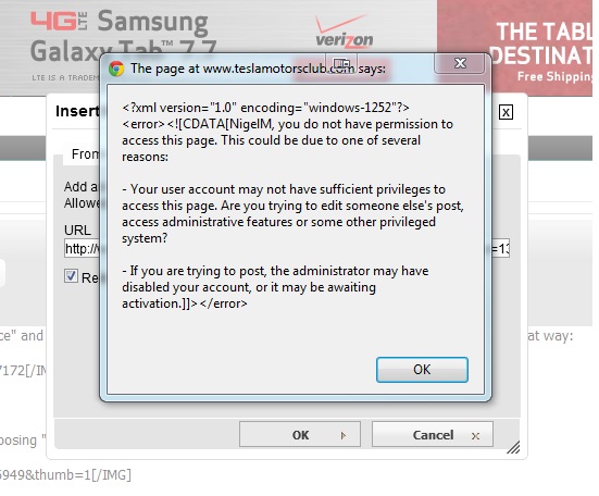
Latest example was this when I tried to insert an image via URL:
Untitled.jpg


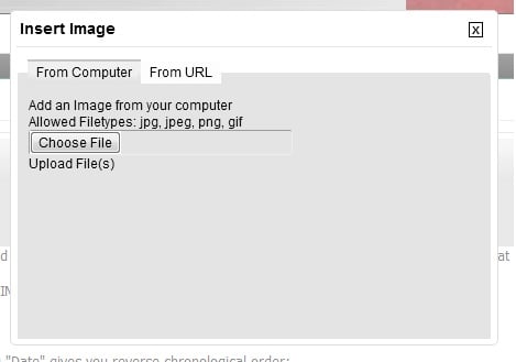
BTW, when trying to insert an image from my computer this is the upload screen:
Untitled 2.jpg
 
ahh.. yeah, there's an issue about uploading attachments since now the image that's there is mine, so it's like you're trying to put an attachment in my account. I think that's the issue anyhow. If you put an image up as a URL it should be fine. That's what I think the issue is anyhow.

I think you could, for example upload your images as attachments in the comments, and then link to the url of the attachments in the wiki.
 
Looks good. Nice work. I agree the read vs. unread thread icon look very similar at first glance. I like CapitalistOppressor's v8 icon for unread and maybe the current grayish unread icon can be left the way it is. The arrow icon for first unread post also seems to be back to the small icon size it was before making clicking on it with iphone or iPad more difficult.
 
There seems to be a problem with the font color.

In our Group forum the color of the font of existing discussions is an extremely light blue-green that is unreadable unless highlighted.

The same is true on the text accompaning poll charts, and previews of postings. Right now as I compose this posting I can't read the preview on this content.


Here's a screen shot of a preview of this posting:

screen shot.jpg


Zoom the above screen shot and check out the preview text.

Larry
 
The Chrome browser doesn't seem to have this problem.

I use Internet Explorer.

Larry
Which IE version, Larry?

I'm guessing this may be triggering...

Code:
	<!--[if lt IE 8]>
	<link rel="stylesheet" type="text/css" href="css.php?styleid=27&amp;langid=1&amp;d=1345497312&amp;td=ltr&amp;sheet=popupmenu-ie.css,vbulletin-ie.css,vbulletin-chrome-ie.css,vbulletin-formcontrols-ie.css,editor-ie.css" />
	<![endif]-->
 
Ok, I got the old bare bones Mobile style working. You can select it below as "Mobile-old". The current version of the software handles the way styles are selected differently, so the Quick Style Chooser was broken. That meant that once you had selected the mobile style there would have been no easy way to leave it.

I have a couple other options for mobile, but I haven't had the chance to work on them yet. How many people would use it and on what devices?

Hi Doug,

I truly appreciate your efforts.

I don't usually like to use smartphone browsers. You have to have eyes like a buzzard and fingers like a safecracker. :frown:

Regardless, I found your efforts very effective and would use it on my Android smartphone when I am away from my computer. I don't know much about these things, but your so-called bare bones works very well and its all that I need.

Larry
 
I didn't forget about this. The red seems a bit harsh here.

View attachment 9447

Do you have an example of a red you like better?

I tried to match it up to the main banner (which is multiple shades of red), but the net effect of the native 3d highlights makes it pop a lot more than the banner does despite using a similar color range.

4, 6 and 7 (especially 7) don't have as many highlights. 6 is probably the closest to the over all color balance used in the banner while 7 emphasizes the darker portions of the banner. Try them (if you haven't already) and get back to me about your thoughts or with a sample you'd like me to match.

Edit: Also, maybe the problem isn't that the red is too harsh, but rather that it just looks that way in comparison to the grey icons. We can change that color as well to something more complimentary.

Edit2: Try swapping the light blue for the grey as a start. The compliment to red is green but blue is a component of green so would likely look better than the grey.
 
Last edited: