Good Lord, yes. The original HVAC controls were just fine. Not perfect (can think of some improvements), but intuitive enough and one-click-for-everything. Now you have to go through a popup (minimum of 2 presses, and can't really be done without a visual) just to turn it off. Super annoying. The 3-second-hold option is not really an option. I'm not going to take my eyes off the road for three seconds to hold my finger in place on a touch button.
After having given them some slack and using v9 in both the S and 3 since release... I really don't like the interface in either car. There are just too many things that should be simple tasks readily accessible that are stashed away behind too many button presses. I constantly find myself fumbling around with the touchscreen way more than I should be. Things are closer together and smaller, and require more presses to accomplish, leading to errors.
Unfortunately, on the Model 3, this is probably never going to be fixed, since there are virtually no physical controls and limited screen real-estate that has to be shared with instrumentation. It "works", but it's just not ideal by any means and overall I just don't like it. As for the S/X, there is plenty of screen real-estate and at least a few physical controls. There is no reason something as simple as turning off the HVAC should take more than a tap. The Model 3 UI in particular is probably just a lost cause due to the physical limitations of cramming everything needed on a single smaller screen.
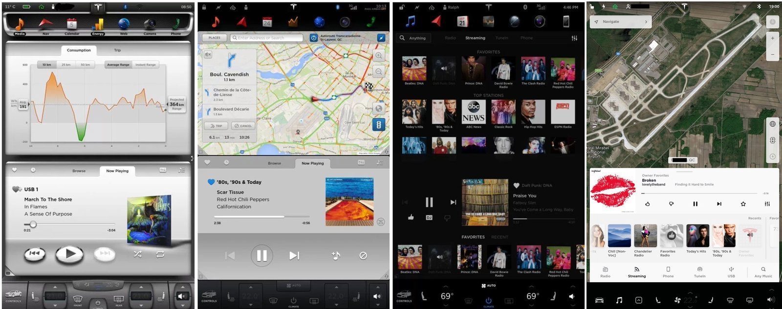
Let's look at a bit of the de-evolution of Tesla's UI over the past few versions. Just facts and my own notes, from memory and glancing at the screenshots below. You may or may not care about the changes, but that's not the point. Also, mostly from an S/X standpoint.
(v6,v7,v8,v9 - Credit Electrek)
- V6.x
- Everything you'd need during a drive is accessible with a single press in a static location
- Camera, majority of common HVAC controls, energy, nav, media, etc
- You know, exactly how you'd want something if you want to be able to do it without distraction.
- Real-time power consumption meter with high accuracy available on the IC
- This is still available to non-AP cars, actually.
- Large energy meter in the center of the IC
- This was great for a quick visual indication of SoC
- Odometer always available
- This seems like a no-brainer to me, but, whatever
- Dual app support
- Can have any two of the "apps" open at a time on the screen
- Definitely a skeuomorphic interface
- Lots of opinions there, but I think it was done pretty well overall.
- v7.x
- First public autopilot release
- Public release included the first "hold the steering wheel" nags
- However, these nags were not timed and pointless, they only happened when the system actually needed human assistance... you know, like these things should be
- Removed original visuals from IC
- Realtime power consumption/regen meter moved to the IC "energy" panel
- There is no accuracy here anymore, as there aren't even ticks at reasonable intervals to estimate power usage
- Range/energy meter reduced in size by ~90% to the size of a cell phone style battery indicator
- Basically the fuel gauge on the car went from a reasonable size to something like 25 pixels.
- Lost outside temp reading on the IC and CID
- Eventually corrected on the IC side due to outrage, IIRC
- UI in general starts it's transition to super flat
- Not quite 8.x+ flat yet, but well on the way
- Apps fill in the gaps gained on edges from v6.x and prior's skeuomorphic interface
- This revealed some screen burn issues in some early cars
- Despite a flatter more spartan UI (thus, potentially less resource intense), overall responsiveness and performance gets worse
- Odometer not always available now
- May not sound like much of a problem, but it's highly useful to have the odometer available at a glance for people who need to track mileage for various reasons.
- Probably way more that I'm missing, but overall, aside from the AP related visual changes and shuffling, there wasn't a lot in terms of usability affected.
- My biggest complaint about this version was the loss of the usable realtime power meter.
- v7.1 introduced the first timed AP nags that were not related to confidence
- Edit: It's worth pointing out that the transition from a skeuomorphic style interface to ultra flat is likely partially due to some screen burn issues in older cars.
- v8.x
- Pancake flatness achieved. Zero visual separation between controls anymore.
- The app selection bar no longer stays on the screen when using navigation at the top of the screen
- So now, if you have nav at the top, and want to go to another app, you have to first click somewhere at the top to make the nav bar appear (actual animation you have to wait for while nav shrinks to make room), then pick your app.
- Workaround was to keep nav on the bottom half app, but this was not ideal.
- Nav could now extend up to the top of the screen to get a few more pixels of real-estate at the expense of quick app changes (See above)
- With the super flat UI (ie, no borders or anything between controls), definitely was difficult to tell active from inactive functions at times.
- Media player was overhauled... but that's a whole different thread
- The media player could now be a double sized app, like nav, and be mostly full screen
- Despite going even flatter with the UI, performance continued to get worse!
- Eventually was improved a bit in later released with an updated Linux kernel
- Despite the visual changes, most functionality remained (aside from losses noted above and carried from other versions)
- On the autopilot side...
- v8 continued to add increasingly annoying nags. Timed nags were bumped in frequency, and actual punishment of the driver implemented for ignoring them.
- Speed restrictions were added to autopilot, reducing functionality
- v9.x
- And here we are... there is probably too much to get into here
- I though the UI had achieved full flatness in v8. I was wrong. Somehow they managed to surpass the previous level of flatness.
- Loss of ability to run two apps
- The "workarounds" for this are BS, as we're always stuck with nav now, and many things cause changes unprompted that dont automatically revert
- Also can only have non-nav at the bottom of the screen.
- All apps hidden behind an extra button press
- This is even worse than v8, as it is always the case now, not just in some configurations.
- The media player isn't even an app anymore
- It pops up and down kind of like the other apps, but it's inconsistent and annoying
- For example, I really just want it gone. I dont ever have the media player up all the time, yet every time I get in the car, there it is! I put it away, eventually it's back.
- The media player is the only "app" with a dedicated button now
- HVAC controls overhauled
- Dual zone controls became hidden behind a slew of touches
- Cant one-touch turn off HVAC anymore
- Cold weather things moved around and now behind even more button presses than before
- If it could take more button presses to accomplish, it does.
- You can not turn off nav now
- This is a waste, as I don't use nav when driving locally
- All other "apps" open at the bottom of the screen now.
- May seem minor, but definitely a loss
- Can not keep the camera or other non-music non-nav app up all the time
- This is a pretty huge one, as being able to keep the rear camera on all the time at the top of the screen is a great feature that's now lost
- A ton of information and interface was dropped to the bottom of the screen, forcing more than just a glance to deal with
- This list is not exhaustive... there are tons more changes, and I don't really know of any v9 UI changes that were an actual improvement
- On the AP side...
- Timed nags are completely out of hand. As often as every 5 seconds you're demanded to "Apply light force", depending on speed, road type, etc. Never more than 20 seconds between nags, though.
- Worse speed restrictions
- Even more broken on newer cars, since they rely on poor map data for speed (AP2+) instead of visually reading the signs (AP1).
- Punitive crap from v8 continues, forcing you to pull over and park the car before being allowed to use features of your own damn car.
I think it's pretty obvious that Tesla's UI is not being designed by people with actual experience in human/machine interface design. In summary, v6 was pretty decent. v7 was alright. v8 was getting pretty bad. v9 is just holy crap wtf were you thinking. (Note: the first Tesla I bought had v4.x)
I really hope they get their sh*t together and overhaul this disaster for v10. The continuous, blatantly obvious, and objectively true loss of functionality version over version is ridiculous, especially when they say things will
improve over time with OTAs.
Suffice it to say, Tesla's complete disregard for this sort of stuff hits a nerve with me. It's highly frustrating and could be completely avoided. As someone who has purchased quite a few of their products, and wants the company to succeed, I fear that they're just going to be knocked out of the water when one of the existing OEMs decides to actually do so... and that's pretty sad, really.